May, 2026
Developpement of Moving map
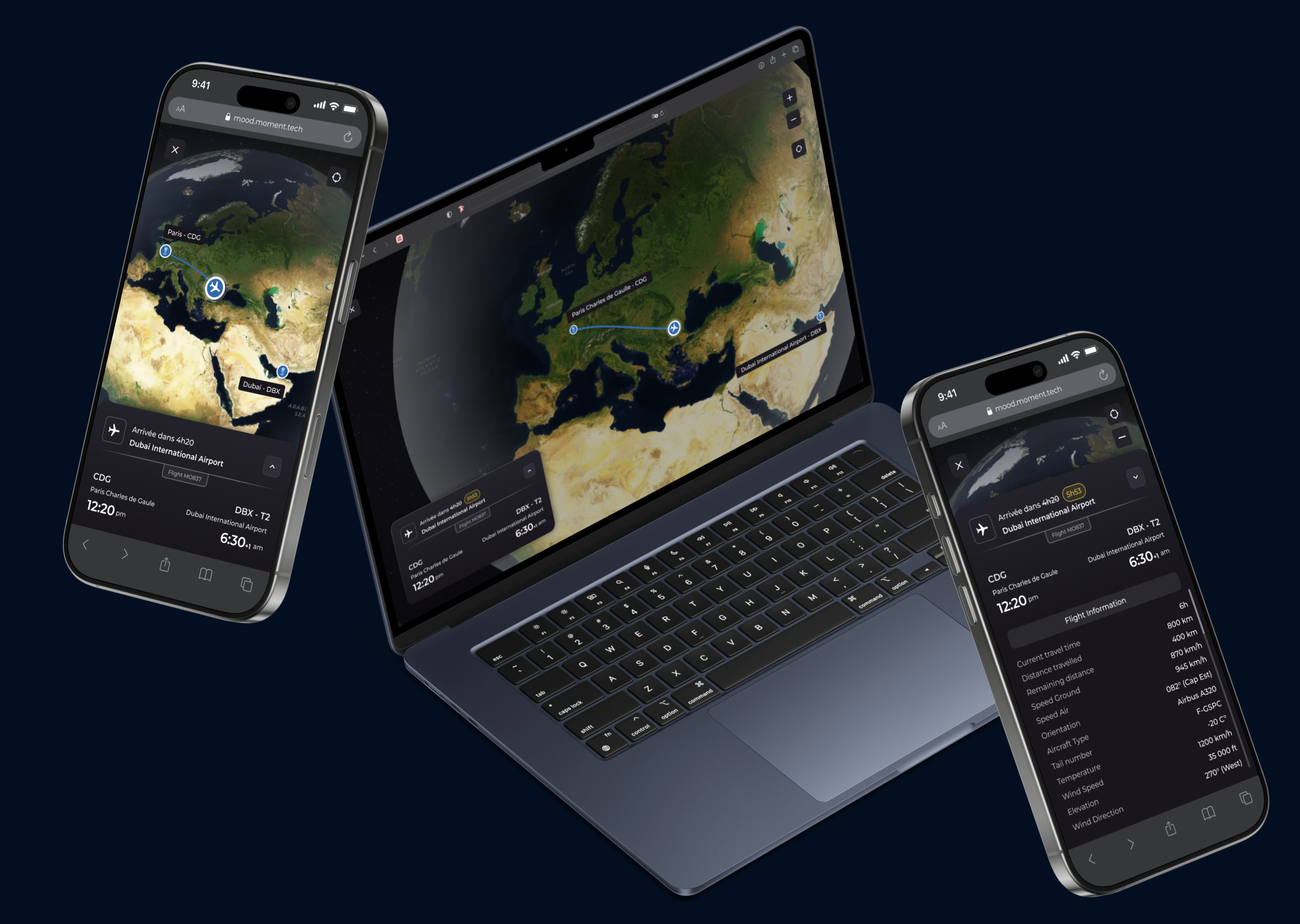
The moving map is a core feature of the Mood product. It displays real time inflight information that passengers need such as remaining travel time, airports or stations, flight or train numbers, and traffic updates to help travelers throughout their journey onboard.
Project Context
As part of a product optimization initiative for the Mood platform, I was tasked with redesigning the moving map. The goal was to display essential journey details to reassure travelers about their remaining travel time, featuring a clear visual representation of the route on the map. Additionally, the information panel needed to accommodate secondary details like current speed and outdoor temperature to complete the experience.
My Product Manager gathered user feedback from our clients and prioritized it within a Jira ticket, providing full product context.
Based on this scoping, my core challenge was: How can we structure a high volume of information to keep the moving map modal clean and intuitive, while ensuring it remains modular across both airline and railway contexts ?
Stacks used


Skills mobilised
Ux design
Information architecture
Design system
Design QA
Scalable components
Ia assisted design
User testing
Cross-functionnal collaboration
Design Decisions
The moving map development focused on a modular panel that ensures consistency between airline and rail interfaces. It prioritizes ETA, delays, and arrival stations or gates. A pull-tab (or drawer handle) allows users to expand the panel to reveal secondary details, such as full trip metrics and remaining stops for both trains and flights.
The entire feature relies on a single master component capable of toggling elements on or off depending on the context (air vs. rail). This approach avoids duplicating logic across two separate components, making the design system significantly easier to maintain.
Results & Impact
+20 clients satisfied
+6 scalable components integrated
Product proof amelioraiton